

StashAway website revamp
Bringing trust, clarity, and ease to robo-investing
As part of StashAway’s brand refresh, we were tasked to revamp the website. The existing site didn’t align with the new visual identity, nor did it clearly address the informational needs of today’s investment-savvy users.
I was the lead Designer responsible for both UX design and team coordination, working alongside a UX researcher and two UI designers.
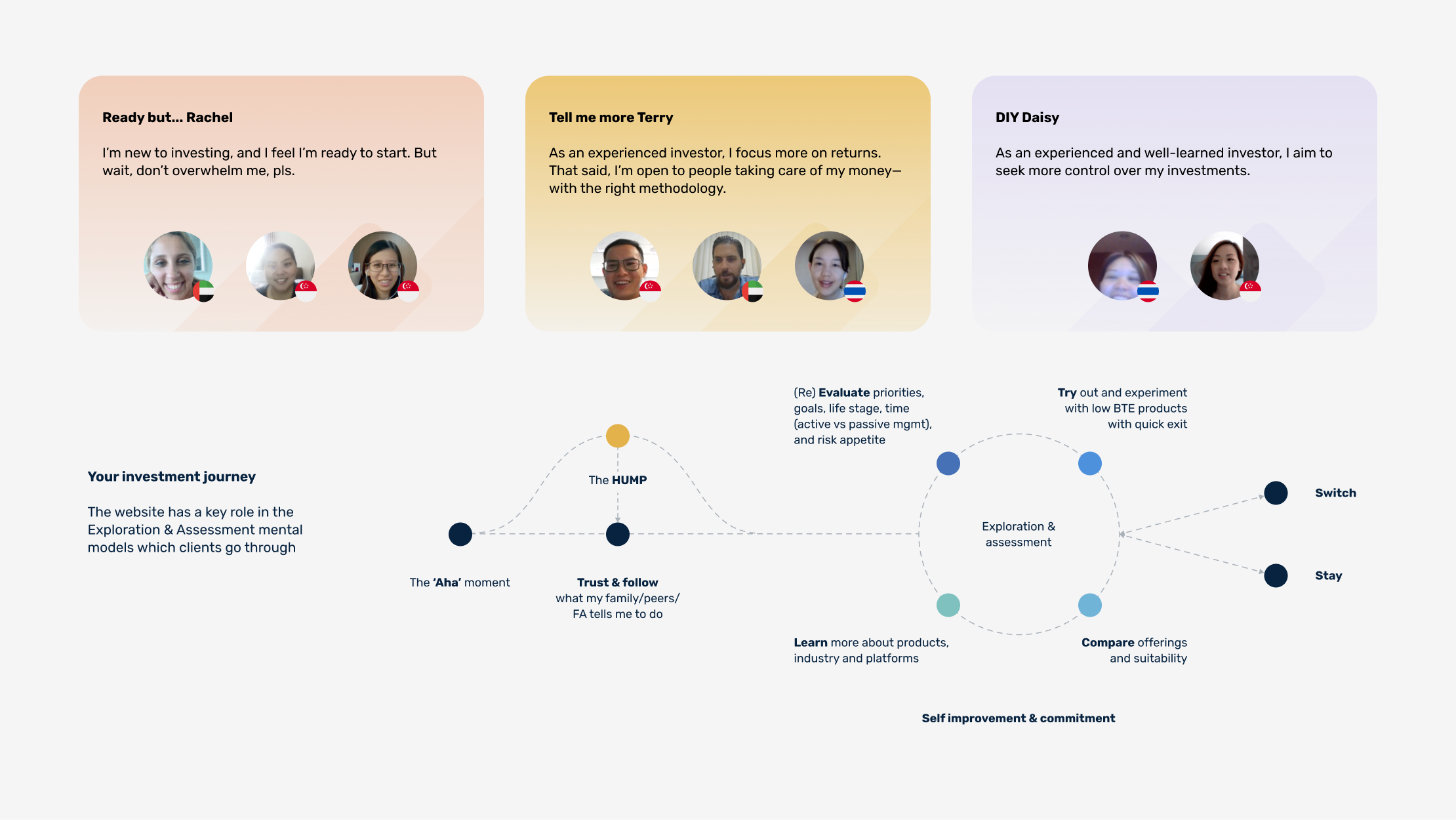
Research & UX Insights
We conducted stakeholder interviews and user research to understand what customers look for in a robo-investing platform. Four key priorities emerged:
Trust and credibility
Ease of onboarding
Verified performance and transparency
Relevance to personal investment goals
These insights informed the new structure, tone, and feature set of the site.
UX Strategy & Key Experience Improvements
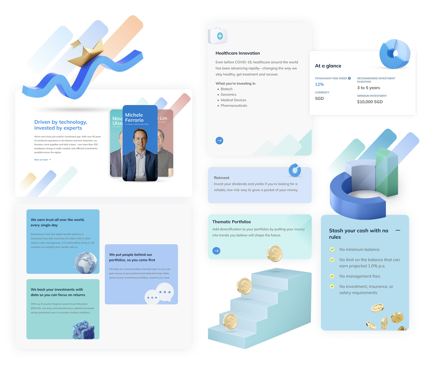
Homepage — Establishing Trust at First Glance
We redesigned the homepage to instantly build trust and communicate StashAway’s strengths. Key credentials such as MAS licensing and a 4/5 Seedly rating are placed prominently. Value propositions—such as expert-backed investment strategies and excellent customer service—are presented in clear, digestible formats. Founder videos add a personal, human voice to the message of credibility.

Investment Discovery — Intent-Led Tabs
Instead of leading with product names, we restructured investment entry points around user intent (e.g., “Grow Wealth,” “Plan for Retirement”). This makes the experience more intuitive, especially for users unfamiliar with financial jargon.


Investment Pages — From Charts to Interactive Tools
We replaced static data charts with interactive widgets, including an explainer for the StashAway Risk Index (SRI). Users can now see how different risk levels affect potential outcomes, with added transparency into how portfolios are built. The experience balances high-level overviews with the option to dive deeper into methodology.
Onboarding & Ease of Use
We streamlined sign-up flows to reduce friction and made educational tools more accessible—like investment calculators and product guides—so users can make confident decisions early in their journey.

Design direction and system thinking
To align with the brand refresh, we built an entirely new design library
A fresh UI system with modular components and widgets
A more uplifting colour palette that complements the brand’s core dark blue
Use of brand mnemonics (three rising strokes) in interface accents
Subtle 3D-style visuals for hero sections to evoke innovation and depth
Design expertise highlighted
Strategic UX leadership
Led cross-functional design team through comprehensive website revamp, coordinating UX research insights with UI execution to align user needs with business objectives.
Interactive experience design
Transformed static data presentations into engaging, educational tools like interactive risk calculators and portfolio builders that empower user decision-making.
Design systems leadership
Led comprehensive design library development with modular components, cohesive visual language, and brand integration that supported scalable, consistent user experiences.