
OCBC Digital Banking
Regional localisation and product experience design
Background and Role
Multi-faceted contributions to the bank’s digital transformation efforts — from leading regional localisation to designing integrated partner solutions and supporting visual design across squads.
Lead designers for localisation and partner solution projects, visuals supports at times.
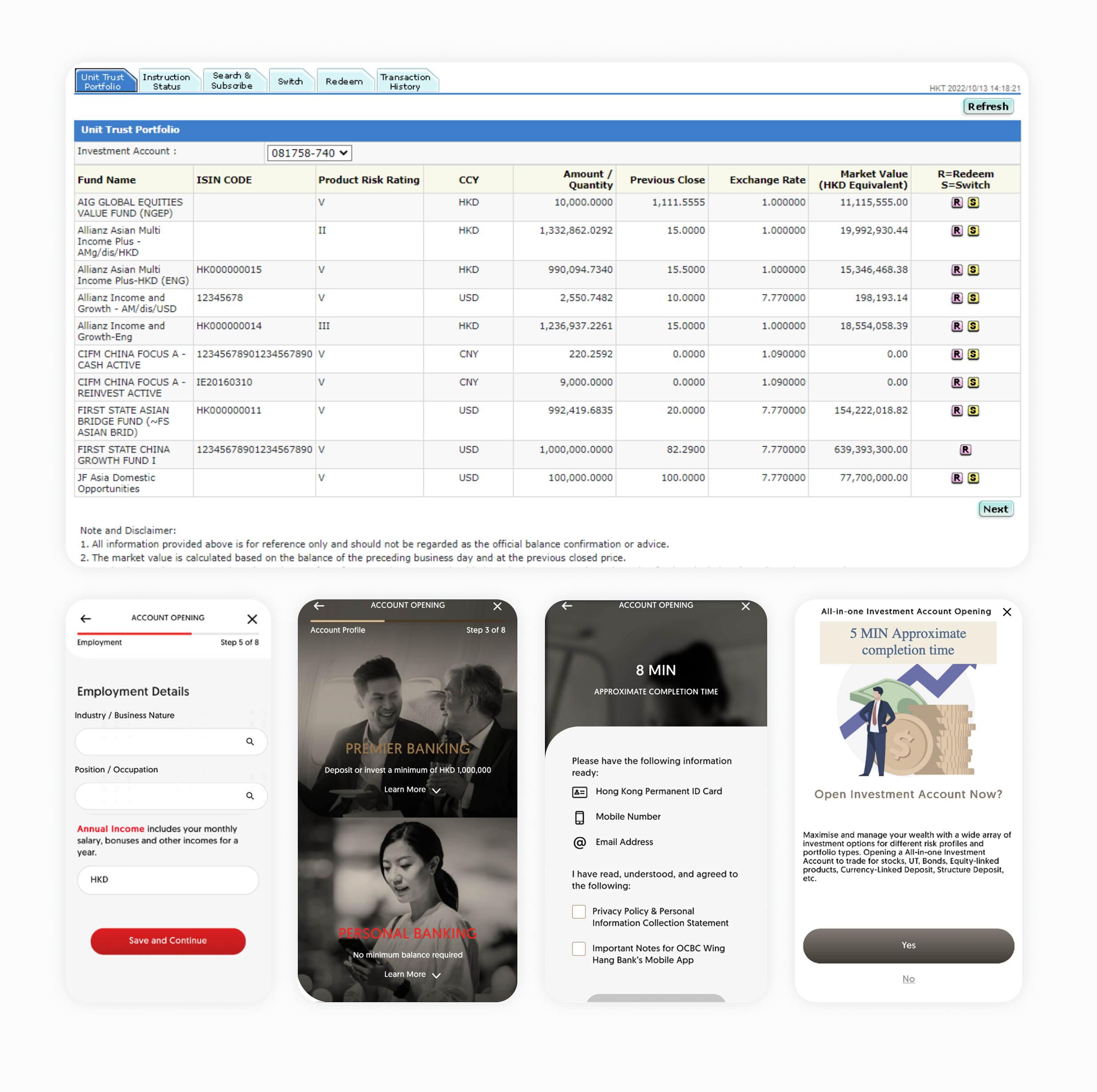
Hong Kong Localisation
As part of OCBC’s regional digital expansion, the bank aimed to streamline digital product experiences across markets using a unified Design Language System (DLS). Leading this localization initiative, this stream of work focused on localising key Hong Kong banking products while preserving Singapore’s scalable logic and design consistency. Key products across various platforms of dotcom, Internet banking as well as mobile banking: Investment account opening, Offshore Account opening, Credit card application and Unsecured loan application.
Discovery
A heuristic review of OCBC Hong Kong's existing digital banking flows revealed two fundamental problems.
Design logic gaps
Application flows for accounts, investments, and credit cards lacked upfront eligibility screening. Customers were investing time filling in forms only to hit disqualifying checks mid-journey, creating frustration and drop-off at the worst possible moment. Entry points were also inconsistent, with no clear segmentation logic guiding customers to the right product for their profile.
Visual fragmentation
Internet banking investment screens were effectively unstyled — table-based layouts with no design system applied. Mobile banking showed completely different visual treatments between standard and premier account opening. Credit card application screens diverged further still. Across touch points, there was no coherent experience.
What informed our approach
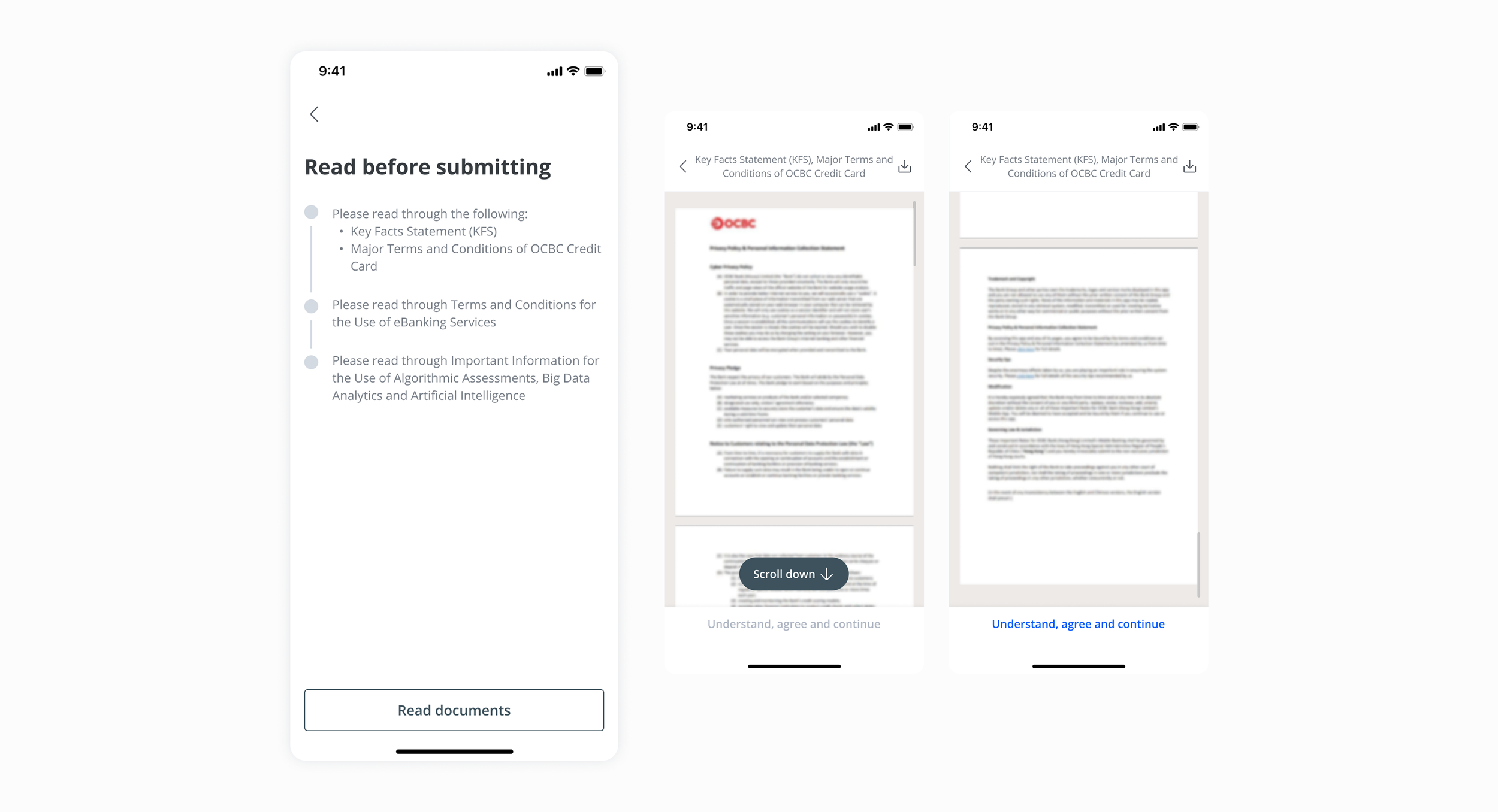
Cross-referenced OCBC Singapore's digital banking flows to understand how eligibility-first logic and product segmentation were handled in a mature market. Audited major Hong Kong banks to understand local compliance norms — notably, terms and conditions were consistently presented as PDFs requiring users to scroll to the bottom before proceeding, a friction pattern we could improve on while maintaining regulatory compliance.
Approach
Eligibility-first
Mapped HK product differences against Singapore's eligibility-first platform logic to create consistent cross-market experiences. Restructured user flows with upfront qualification screening, value proposition landing pages, and preparation guidance to reduce mid-journey abandonment and filter for qualified applicants.

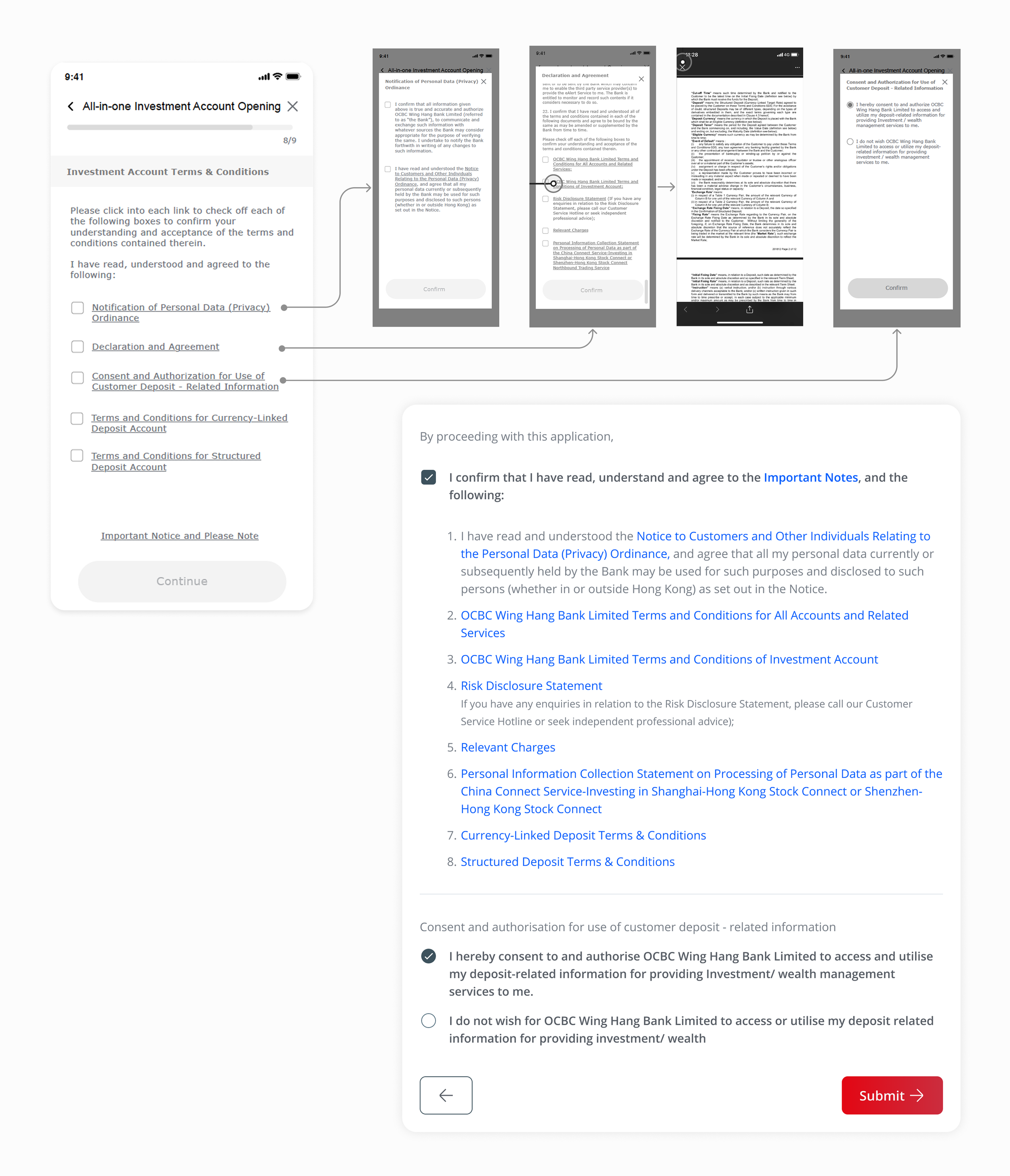
Compliance handling
Consolidated HK's fragmented legal disclaimers and complex nested T&Cs into a streamlined single-entry acknowledgment flow, reducing user friction while maintaining full regulatory compliance.
Visual design alignment
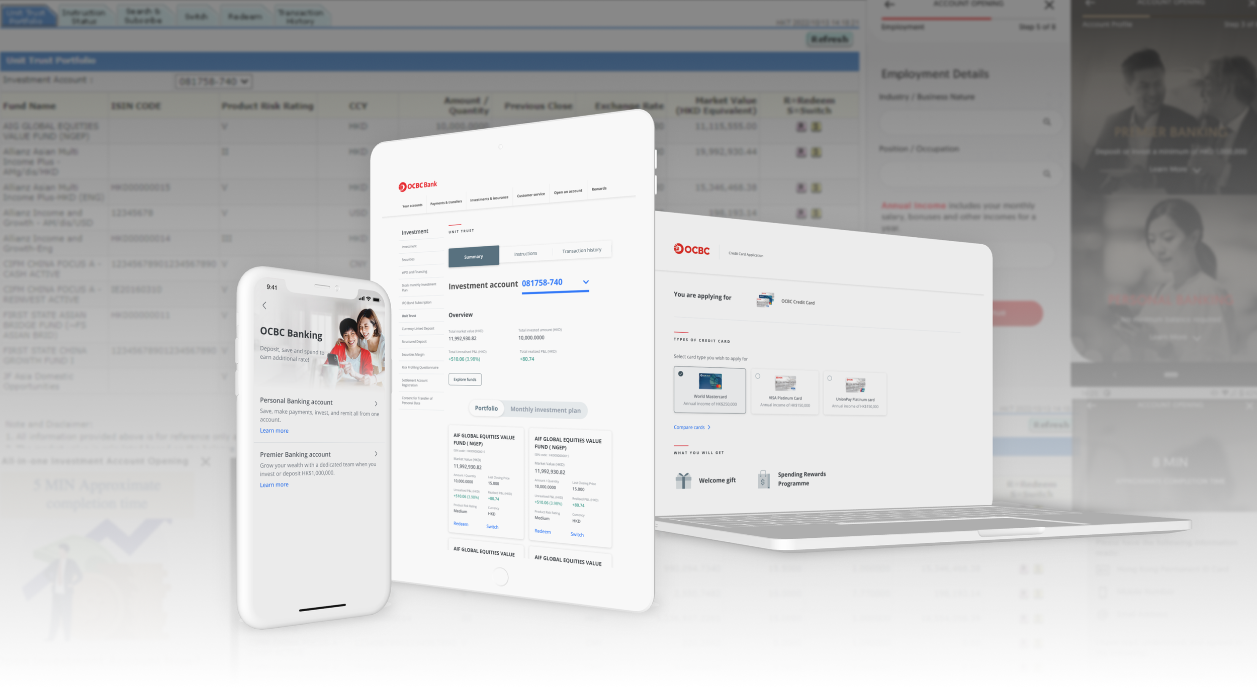
Cross-platform unification aligned disparate visual experiences across mobile banking, dotcom, and internet banking platforms into a cohesive look and feel, ensuring consistent user experience regardless of access point. For example: Funds were previously displayed in a table format, with each fund represented in a row. With the adoption of the updated design library, the layout was shifted to individual card views, which improve readability and scanability. In this new format, action elements are placed near key fund information for easy access, whereas in the table format, users had to navigate to the end of each row to perform actions.
Outcome
Designs were handed off to the HK engineering team and taken into development across all four product lines — investment account opening, offshore account opening, credit card application, and unsecured loan application.
Buy Now Pay Later Integration
Using CX process mapping as foundation, led comprehensive design execution through final delivery phase, delivering flexible, context-aware BNPL integration for a banking app that created seamless cross-platform ( Bank to third-party) user journeys while maintaining trust and clarity. The project is a demonstration of complete design lifecycle execution, although the launch didn't happen due to the closure of third party provider.
Discovery and Research
Discovery
The client provided a process map outlining how their BNPL product (Pace) would integrate with OCBC's existing onboarding infrastructure. Using this as a foundation, we mapped the end-to-end journey across four distinct customer states — new customers with or without an existing Pace account, and existing OCBC customers with or without Pace — to identify where flows would diverge and what each segment needed at each touchpoint. Dashboard logic, merchant and voucher display, and key data points were mapped against assumed customer priorities.
Research through lab tests
Prototype testing and usability sessions were conducted with 3–4 customers to validate comprehension and intent — specifically whether users understood what was happening at each step, and whether they would actually use BNPL within a banking app context.
Key findings
Payment clarity was the biggest trust barrier — late fees, auto-deduction schedules, and payment status were consistently misunderstood
Dashboard entry points were hard to locate, particularly under activity sections
Labelling confusion between transfer limits and buy limits created unnecessary hesitation
Onboarding felt fast but lacked clear signposting — OCBC exclusivity and next steps weren't communicated clearly

Approach
User-centric content strategy
Structured information hierarchy prioritising user decision-making needs. Lab tests revealed the need for clarity on buy-limits, late fees, and PACE points for the customer. We implemented multiple access points to critical information. Relabelled and reorganised dashboard elements based on direct usability feedback
Design for third party integration
Created contextual messaging and visual continuity with clear pathways to manage customer's expectations after the account is created, thus maintaining user confidence during third party transition.
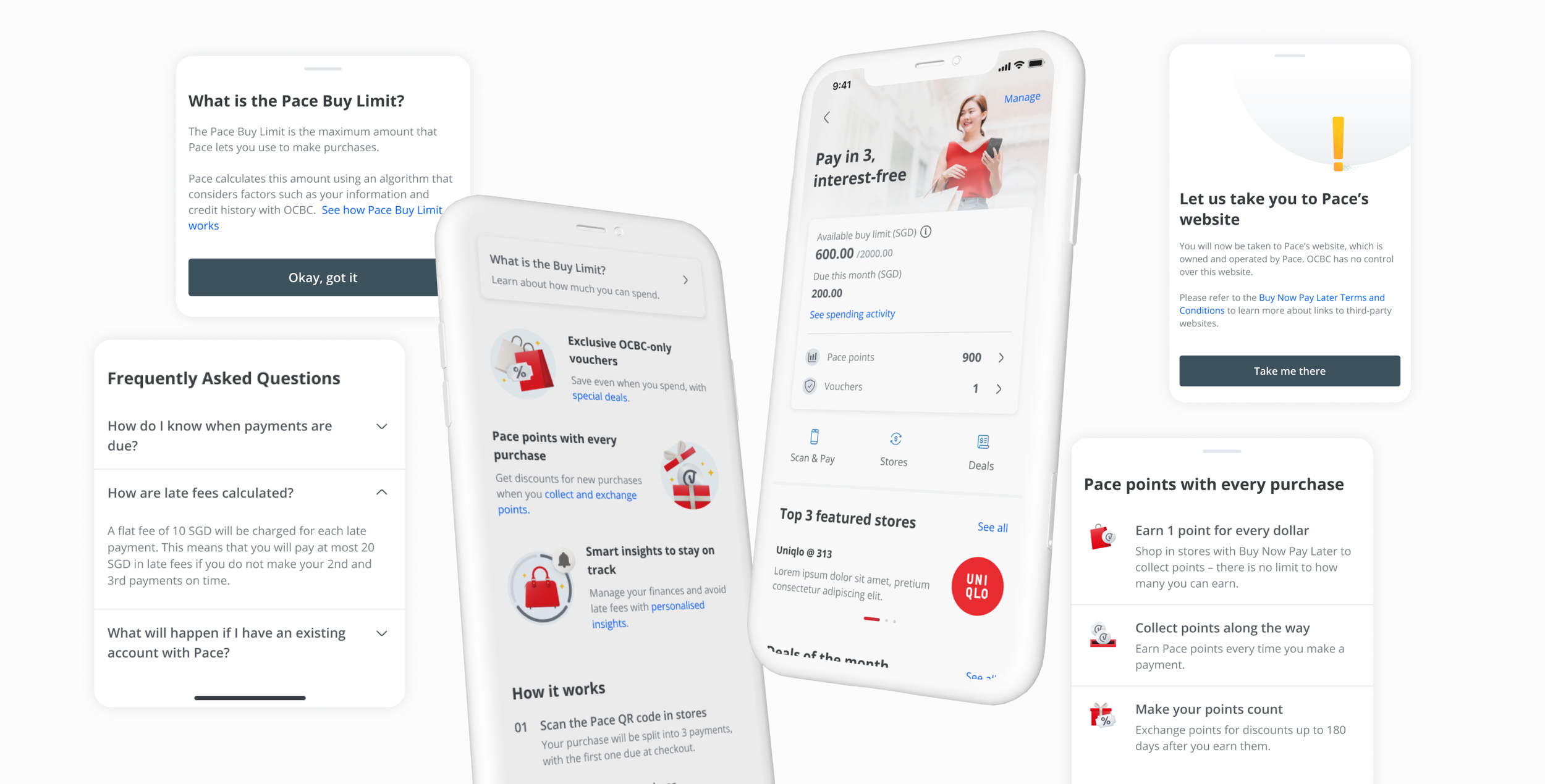
Dynamic user state detection for QR entry
Assuming new customers primarily discover the product through QR scanning, we designed dynamic user state detection for QR entry, embedding account creation within purchase flows to reduce abandonment
Purchase status management
Designed adaptive status tracking catering to real-world scenarios where purchase returns are increasingly common, ensuring clear communication and automatic payment plan adjustments when transaction circumstances change.

Outcome
Design reached final delivery phase with full sign-off before the third-party provider closure made launch impossible. Complete design lifecycle — from journey mapping through lab-tested prototypes to handoff-ready files — was delivered and documented.
Visual design
Illustration Development
Contributed to illustration development and styling exploration when client required visual changes, exploring and adjusting visual style directions for graphics across different sizes while maintaining DLS consistency.
Design System Evolution
Ensured new visuals felt cohesive across the entire app experience by adapting illustrations to the evolving Design Language System standards and requirements.
Digital campaign key visual
Develop art direction and execute key visual elements for OCBC's marketing campaign, including assets for the marketing website and related promotional materials.
