GoNetZero Secondment
UX and design leadership in scaling carbon management for enterprise SaaS
Background and Role
GoNetZero launched as a corporate venture under Sembcorp Industries with an ambitious goal — to become a global platform for carbon management and renewable energy.
By the time I joined on secondment, the product had grown from individual tools into a suite of interconnected modules. The challenge was clear: transition from a collection of features into a unified, enterprise-grade ecosystem that could serve both commercial leads closing deals and sustainability officers managing complex data daily.
I was initially brought in for a 3-month handover to an in-house Singapore designer. As the platform's scope expanded, so did my role — the engagement was extended and the team grew to include offshore counterparts supporting both engineering and design. By the end of the secondment I was directing 2–3 designers across multiple product pillars and the DLS simultaneously.
Discovery
Joined mid-flight, which meant understanding the product required active immersion rather than a formal research sprint.
Domain learning
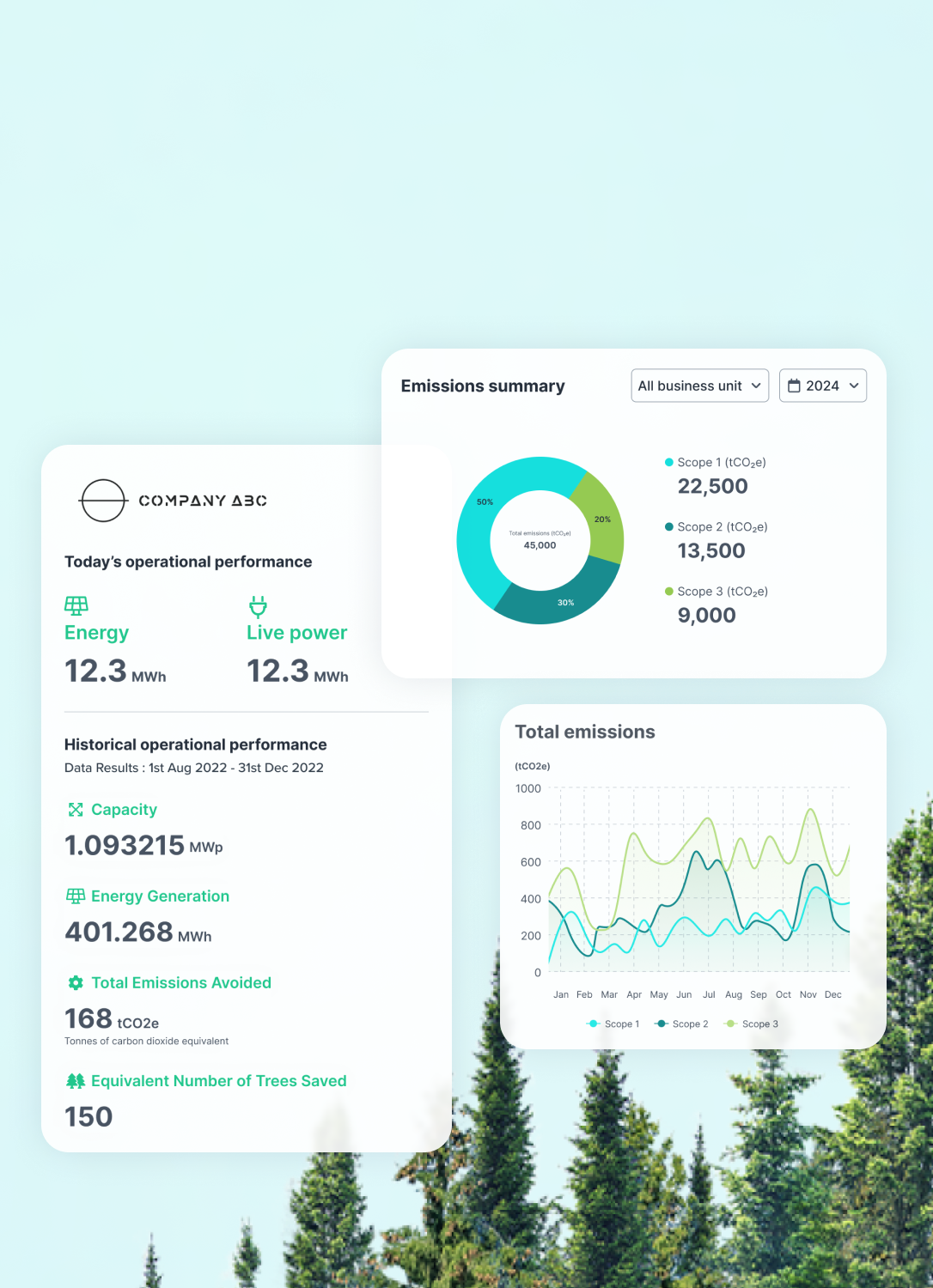
Attended a partnership scoping meetings with Asuene — a carbon management platform — alongside the product manager. The session provided a working reference for how emission tracking flows were structured, what functions a carbon management dashboard needed, and how submission requirements shaped the experience. Separately, worked closely with Sembcorp's sustainability team to understand emission counting fundamentals across Scopes 1, 2, and 3 — essential for designing data visualisations that were semantically accurate, not just visually clean.
DLS diagnosis
As the product expanded into the Perform pillar with increasingly complex charts and data views, it became clear the existing design language — built for marketing and storytelling — couldn't hold. Feedback from multiple internal stakeholders pointed in the same direction. A review of energy data dashboard conventions confirmed the pattern: enterprise data products run leaner grids, tighter spacing, smaller type. Aesthetics had to give way to density and readability.
A Product-First Design Language System
The Pivot from Brand to Product The existing design language was built for marketing—prioritising aesthetics and storytelling. I led the evolution of the Design Language System (DLS) to meet demands of an industrial-strength SaaS product.
Architectural shift
Led the evolution of the DLS from a marketing-centric (pre-login) focus to a high-density Enterprise SaaS framework, implementing a new 12-column grid system that prioritises dashboard real estate and complex workflows over imagery. With the grid changed, typography is another shift that we looked into. For example , Display Header used to be 64px, we’ve reduced to 56px.
12-grid with 88 px margin
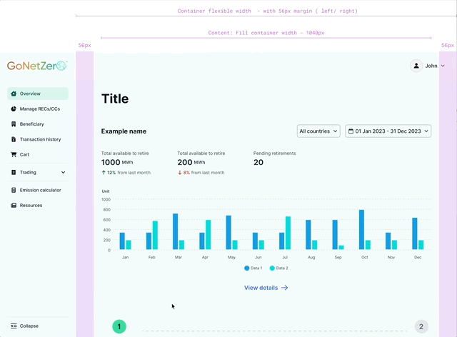
12-grid with 56 px margin for content area, catered for side navigation
Data visualisation standards
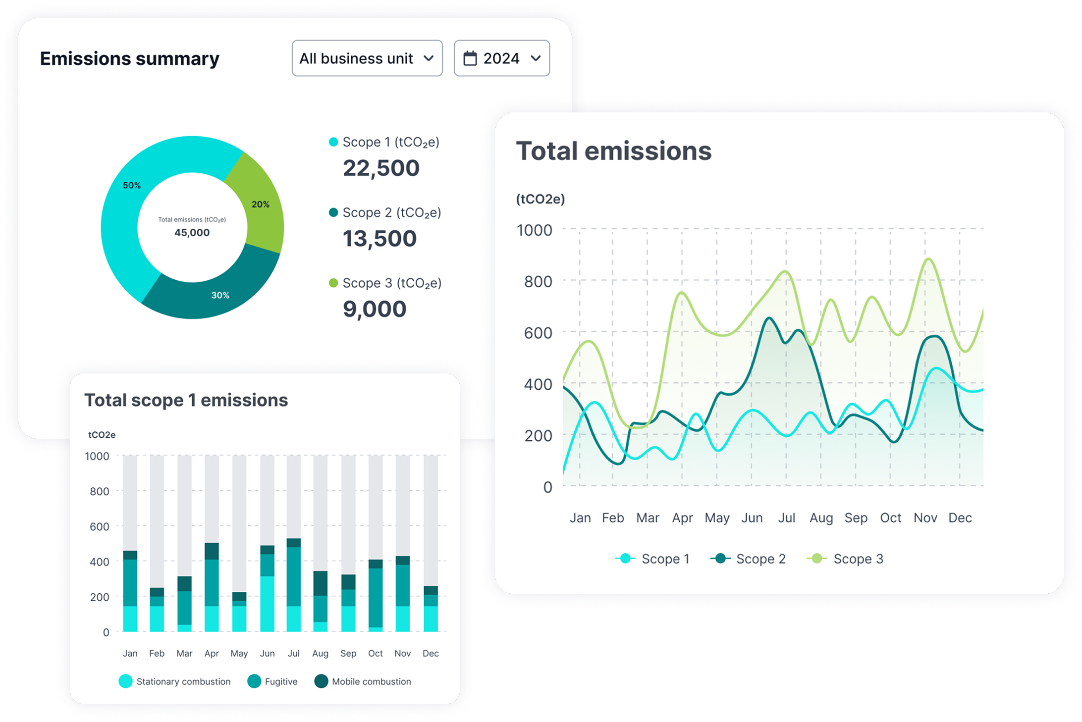
Developed reusable patterns for complex carbon emission charts (Scopes 1, 2, and 3), ensuring semantic consistency and readability across the platform.
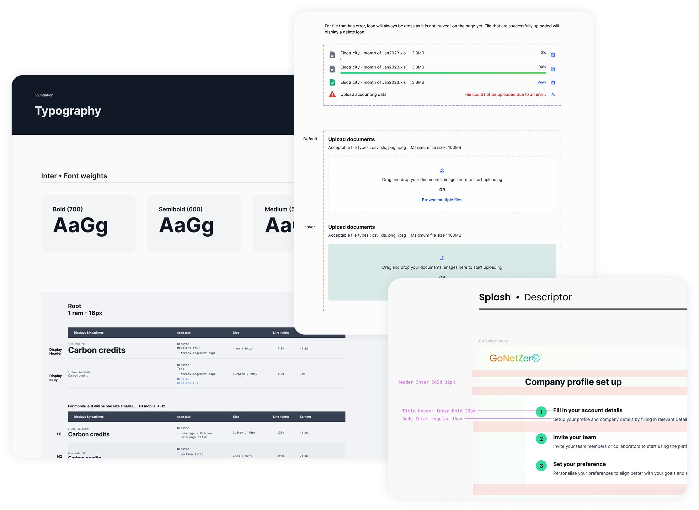
Operational velocity
Established comprehensive component documentation to reduce design debt and significantly accelerate developer hand-off.
Outcome
A design system capable of scaling across multiple product pillars without requiring structural redesign each time a new module was added.
Visualising Product Strategy through Interface
I acted as a strategic partner to the Product team, ensuring the platform’s architecture was not just functional but also future-proof, also helping stakeholders to have a vision of a possible outcome.
Roadmap alignment
Visualised the dashboard architecture to directly align with the long-term product strategy and roadmap. This ensured that as the platform expanded from one pillar to three, the user interface could accommodate new modules without requiring a core structural redesign.
Macro-to-micro UX hierarchy
Architected an organisational "Command Center" tailored for Sustainability Officers to handle high-level executive reporting, integrated with intuitive drill-down paths into granular, data-heavy module views to ensure complex datasets remain accessible and actionable.
Translating Complex Data into Commercial Value
I designed a suite of sales and client-facing tools that transformed GoNetZero’s technical capabilities into a compelling, easy-to-digest narrative for enterprise partners, positioning design as a strategic revenue driver.
Sales toolkit
Developed a high-level conceptual prototype that abstracted technical backend complexity into a narrative-driven onboarding journey; this functioned as both a vision tool for the client's decarbonisation path and a critical feedback loop to validate platform features with prospective users.
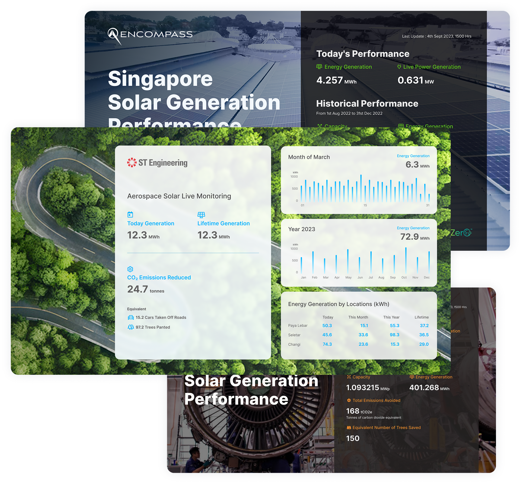
Client "Showcase" Dashboards
Client "Showcase" Dashboards: Established a scalable framework of templates and design methodologies for public-facing energy dashboards, transforming GoNetZero’s technical data into high-visibility branding assets that enable enterprise clients to showcase sustainability milestones and real-time carbon reduction efforts within their physical offices and buildings.
Global Impact and Strategic Tenders
Design solutions for Netherlands Government procurement
I spearheaded the UX strategy for high-value international expansion, leading the end-to-end design for a Netherlands Government tender. This involved architecting flight emission and carbon abatement ecosystem fully localised for European cultural and functional standards.
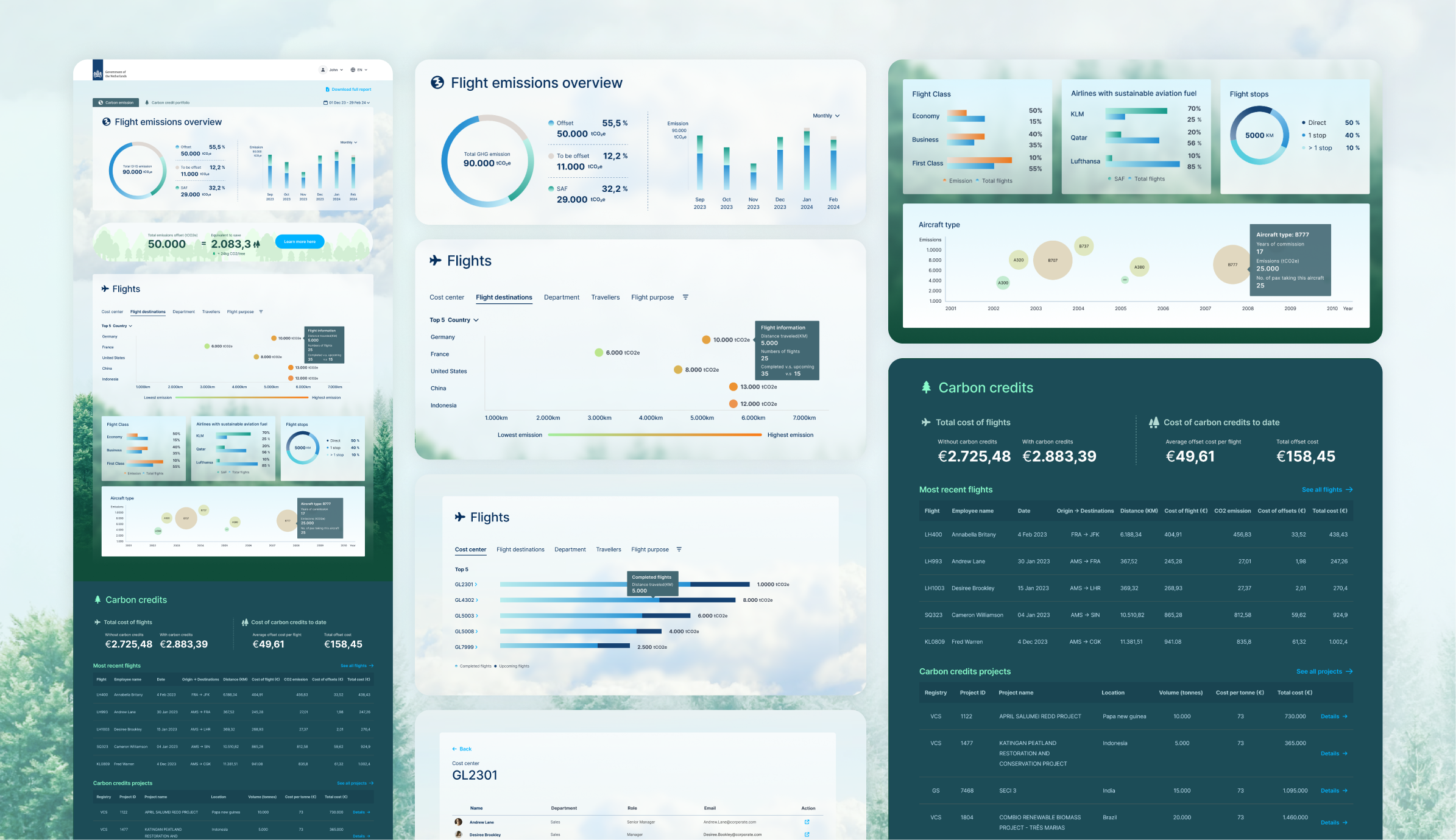
Integrated technical architecture
Designed a seamless experience that integrated an automated project recommendation engine directly into air travel booking systems, allowing carbon offsetting to be a natural part of the procurement workflow.
Dual-layered information hierarchy
Engineered a multi-tier dashboard architecture to serve distinct user needs within a government framework:
Headquarter view: A high-level oversight tool for administrators to manage organisational abatement efforts.
Individual view: A personalised interface for employees to track their specific travel footprint
Headquarter view
Individual view
Outcome
The UX and Design portion of the tender received a perfect 10/10 score from government evaluators — officially validating the quality, clarity, and usability of the interface. The overall tender was not awarded due to external project factors unrelated to the design.