

StashAway Website Revamp
Bringing trust, clarity, and ease to robo-investing
Background and Role
The existing site didn't reflect the new brand, and more critically, wasn't giving investment-savvy users what they needed to trust a robo-advisor with their money.
I led the project as lead designer, supported by 2 x UI designers and researcher.
Discovery and Research
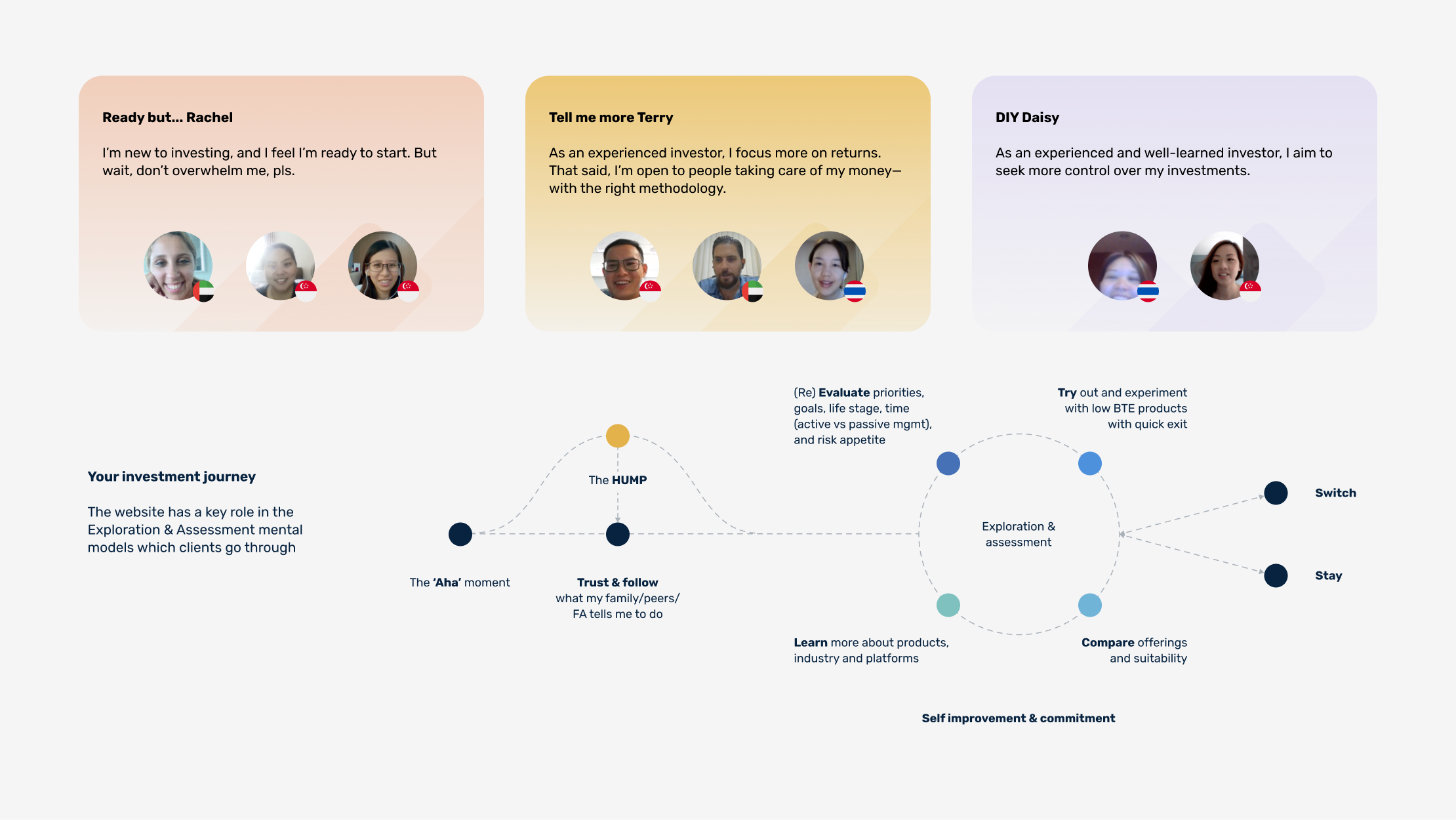
Conducted stakeholder interviews alongside user research with 8 participants spanning different backgrounds, levels of investing experience, and familiarity with StashAway. Speaking to both internal stakeholders and external users gave us a complete picture — what the business needed to communicate, and what potential customers actually needed to feel confident enough to invest.
Four priorities emerged consistently:
Trust and credibility — users needed to feel StashAway was legitimate and regulated before engaging further
Ease of onboarding — friction in the sign-up flow was a barrier to conversion
Verified performance and transparency — investment-savvy users wanted to interrogate the data, not just read headlines
Relevance to personal goals — generic product descriptions weren't connecting with users' actual financial motivations
These four findings directly shaped every design decision that followed.
UX Strategy and Approach
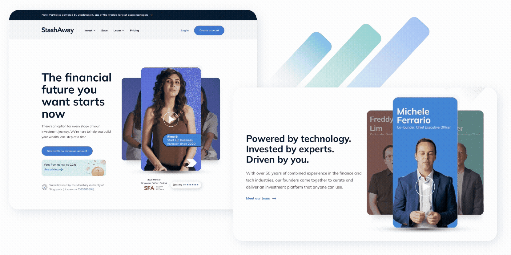
Homepage - Establishing trust and credibility at first glance
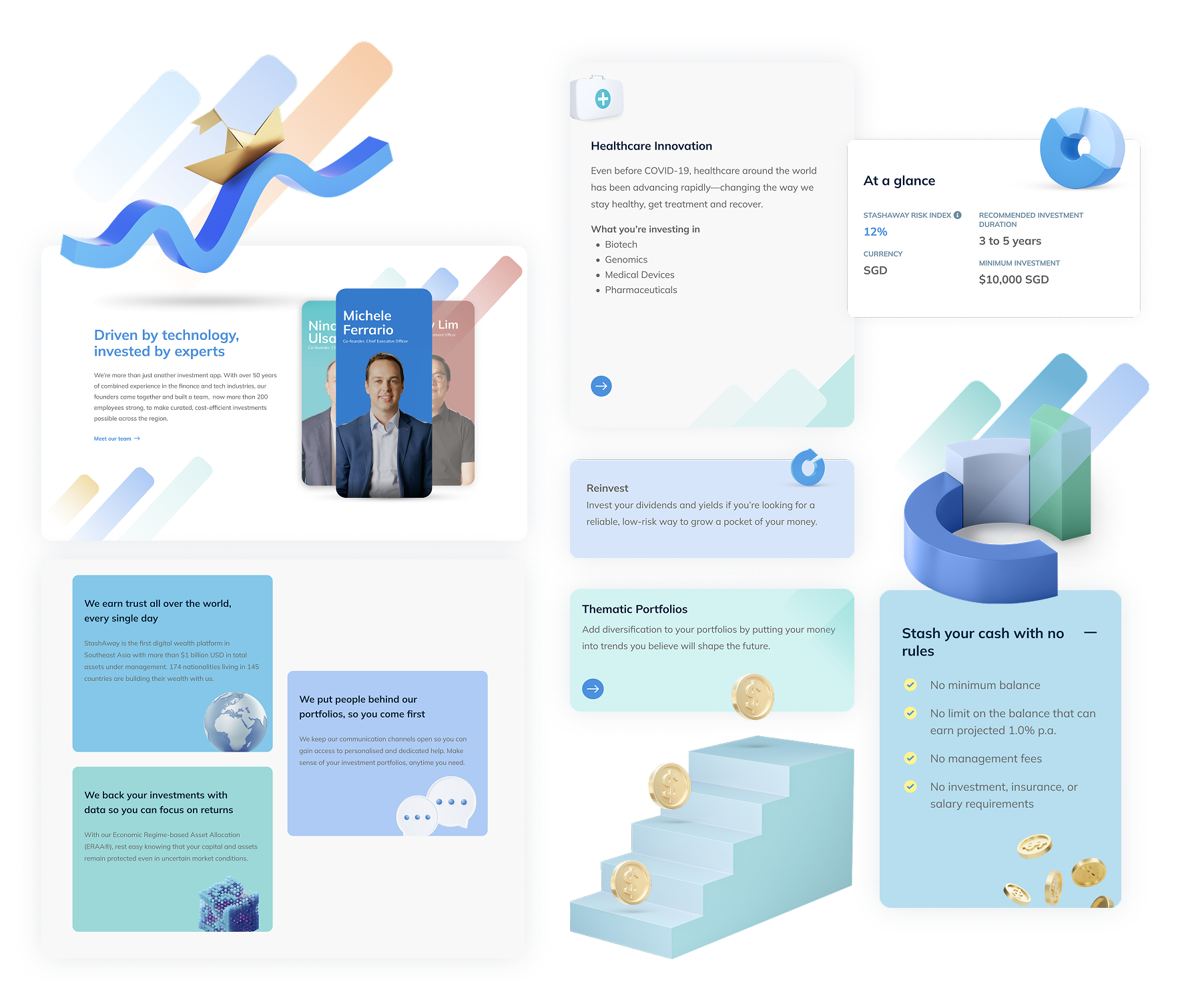
We redesigned the homepage to instantly build trust and communicate StashAway’s strengths. Key credentials such as MAS licensing and a 4/5 Seedly rating are placed prominently. Value propositions—such as expert-backed investment strategies and excellent customer service—are presented in clear, digestible formats. Founder videos add a personal, human voice to the message of credibility.
Investment discovery - Relevance to personal investment goals
Bridging relevance between customer’s investment goals and the products. We restructured investment entry points around user intent (e.g., “Grow Wealth,” “Plan for Retirement”). This makes the experience more intuitive, especially for customers unfamiliar with financial jargon.

Investment Pages - Verified performance and transparency
We replaced static data charts with interactive widgets, including an explainer for the StashAway Risk Index (SRI). Users can now see how different risk levels affect potential outcomes, with added transparency into how portfolios are built. The experience balances high-level overviews with the option to dive deeper into methodology.

Ease of onboarding
We streamlined sign-up flows to reduce friction and made educational tools more accessible—like investment calculators and product guides - so users can make confident decisions early in their journey.

Design direction and system thinking
To align with the brand refresh, we built an entirely new design library
A fresh UI system with modular components and widgets
A more uplifting colour palette that complements the brand’s core dark blue
Use of brand mnemonics (three rising strokes) in interface accents
Subtle 3D-style visuals for hero sections to evoke innovation and depth
Outcome
The revamped site launched successfully and was handed over to the client post-launch. Each design decision traced directly back to the four research priorities — the site structure, information hierarchy, and interaction patterns were all research-led, not assumption-led.