
Sentosa Islander web experience
Web-based revamped loyalty programme
Background and Role
Sentosa revamped its membership programme with new reward tiers, points earning, and voucher redemption.
Due to project timelines, we focused on enhancing the web app experience to showcase these updated loyalty features using a mobile-first approach.. My role in this project is the UX Designer responsible for point earning and voucher redemption features, user flows, and C-suite stakeholder presentation for proof of work. Developed a day-in-the-life scenario from a key user persona to map how a typical member would interact with the programme across a full Sentosa visit — from arrival and access through to spending and redemption.
Discovery and Reseach
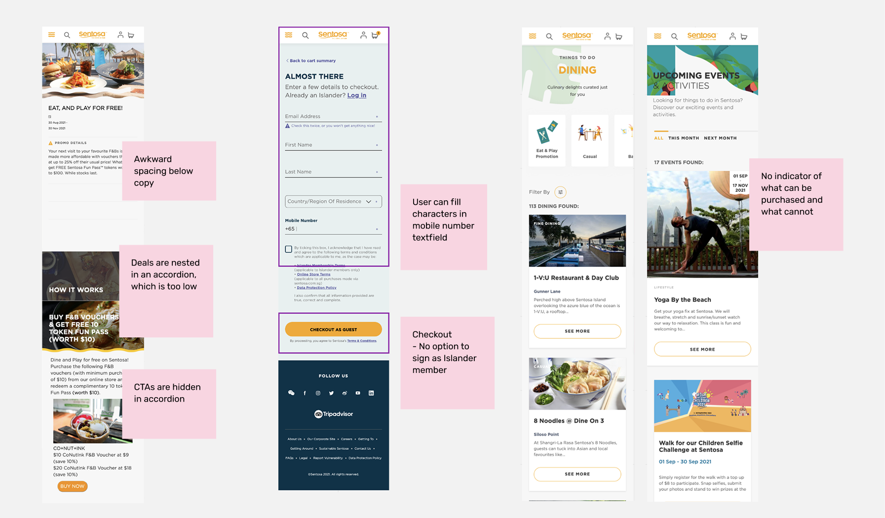
Digital audit
Conducted a cross-platform audit of the existing web and app experience, mapping pain points across the full browsing and purchasing journey.
Key findings:
Browsing — each fold surfaced only 1–2 SKUs, CTAs were buried or hidden in accordions, and there was no way to tell what was purchasable versus not
Navigation — app and website created a fragmented experience, with users bouncing between platforms mid-journey. Search only appeared on scroll. Bottom nav disappeared when browsing promos
Purchasing — two separate carts across app and website caused confusion. Credit card details couldn't auto-fill. Returning users had no remembered state unless signed up — making repeat purchases painful
Post-purchase — no wallet-like storage for tickets or deals, no celebratory moment after purchase, no next-step guidance
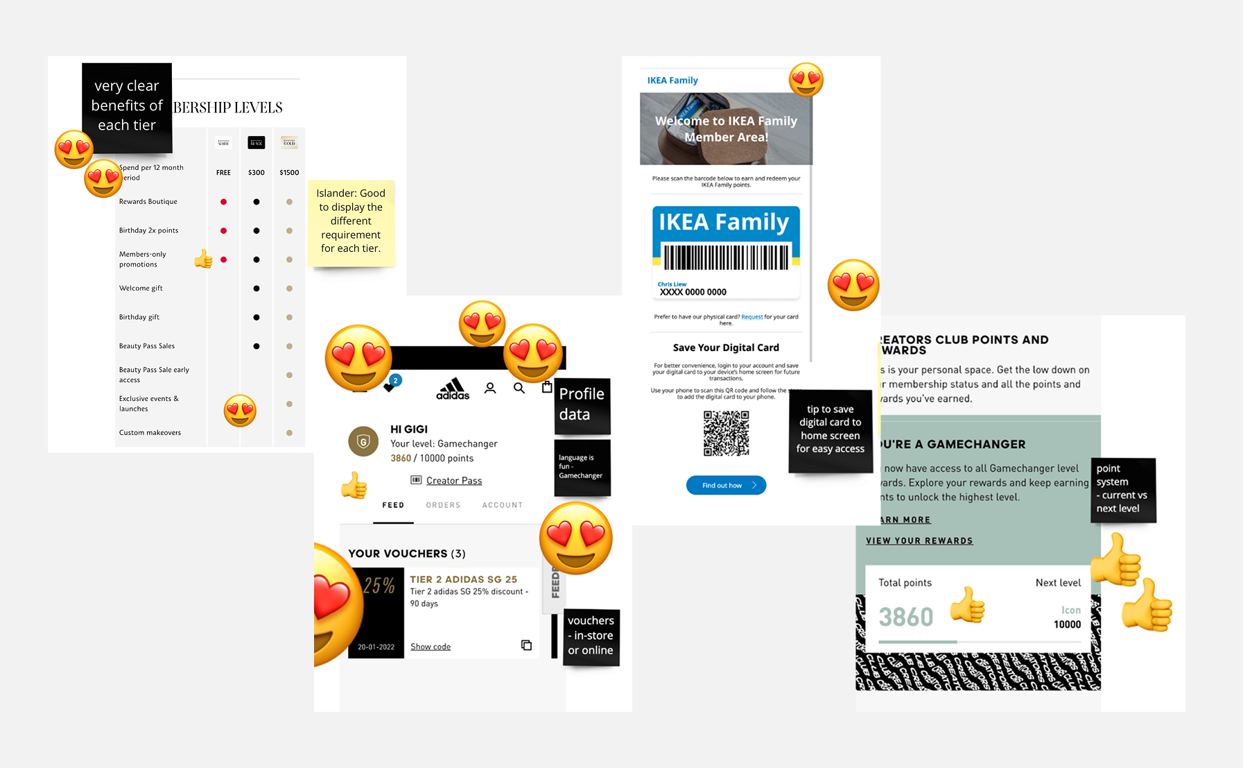
Competitive benchmarking
Reviewed loyalty programme experiences across Ikea, Adidas, Tangs, and Sephora to understand best-in-class patterns for membership tiers, points tracking, voucher management, and onboarding incentives.
Client workshop
Shared audit findings with Sentosa stakeholders in a discovery workshop. Clients reviewed findings and voted on features and functions to prioritise — aligning design decisions to both user needs and business appetite.
Approach
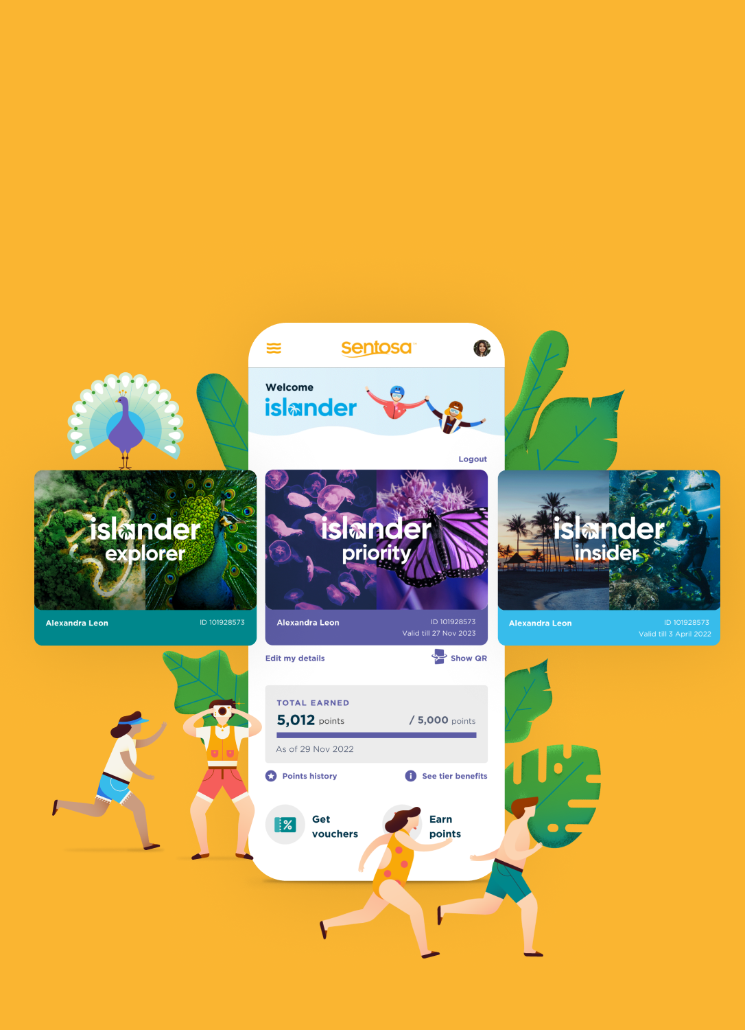
Everything at a glance - Dashboard revamp
Fraud solution
Sentosa's concern was straightforward: members screenshotting their QR code and sharing it with friends or family for free island access. Designed an animated masthead for quick visual verification, followed by member card display and a flip-to-reveal QR code mechanism — making static screenshots non-functional for access while keeping the experience frictionless for legitimate members.
Track progress
With the newly added tracker, members are motivated to see the progress to the next tier of membership. Lastly introducing My pocket that serves as a wallet for members to find new vouchers, existing benefits or purchases.
QR code scanning at merchants
A single static QR code at each merchant location powers both point earning and voucher redemption through an intelligent web-based scanner. Members scan once using their native phone camera without switching apps, and are automatically routed to a mobile-optimized interface offering clear "Earn Points" or "Redeem Voucher" options—no app downloads required. This smart routing system simplifies merchant setup while delivering a seamless dual-function experience for members across any device.
Points and vouchers
With introduction of points and tiers, functions are introduced within the web-based app. Hygience function as point history as well as voucher listing for members to keep track on.

Outcome
The revamped web experience launched successfully and drove meaningful membership and engagement:
66,541 sign-ups, with 48,851 completing their profile
22,446 vouchers claimed; voucher claim mechanics proven effective
357,831 points earned across the member base
Average local spend on the island increased from $15 to $50 — a 3x uplift
Shortly after launch, Sentosa moved to build the full native app version, using the web experience as the proven foundation.